
How this proposal was built
Research first, then an audit of what it turned up, then a design that answers it. No theme was edited and no code deployed.
-
1
Read the store the way a buyer does
The catalogue gone through product by product, the buyer types written up, the brands in the category compared, and nine sales channels checked for price and stock.
-
2
Write down what is costing sales
Eighteen findings against the live storefront — speed, navigation, collections, reviews, and a mobile product page running almost fifteen screens before Add to Cart — each evidenced by the screenshot or measurement behind it.
-
3
Answer each finding on screen
Two homepages drawn against those findings — both with shorter routes to the right product, proof beside the price and one honest shipping promise. Same fixes, two ways of positioning the brand, so the decision stays with you.
Two directions
Two homepages answering the same eighteen findings. Neither is put forward over the other — what separates them is positioning, and that call belongs to you.
They look alike on purpose. Both are built from the same component set and both close the same findings: one shipping threshold instead of two, the 191 reviews carried onto every card, classroom pricing published on the page, and Zoe’s story where buyers reach it. Direction A is a design canvas and Direction B a clickable prototype — that is how far each was taken, not a verdict on either, and either can be finished to match. What actually separates them is set out under the two pages.
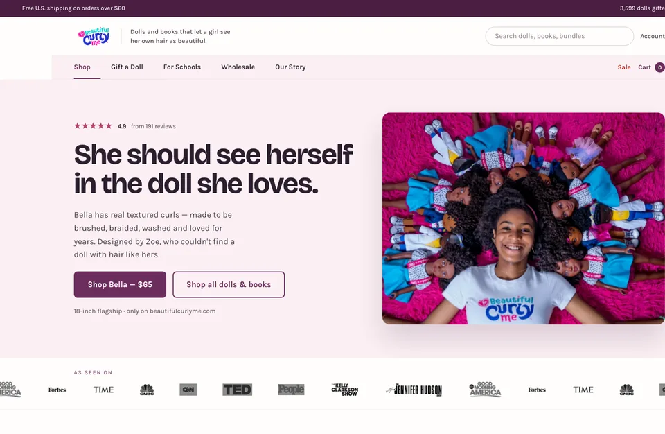
Sorted by her age
Opens on representation — “She should see herself in the doll she loves” — and sorts the shop by how old she is. Built around the one 18-inch doll, written to mothers, with a gift finder and a wholesale door of its own.
Design canvas — homepage v1
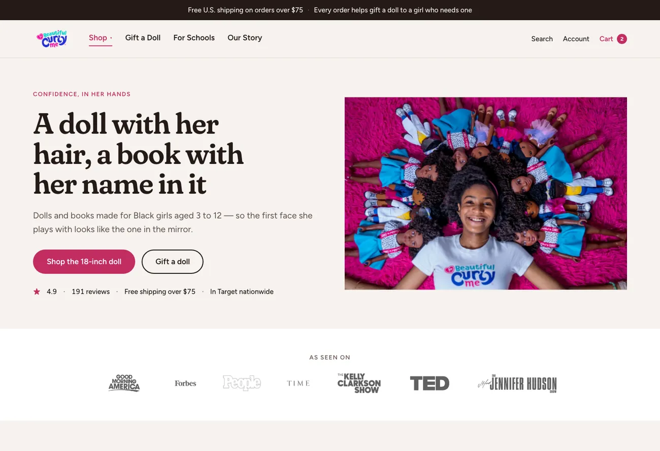
Sorted by what she needs
Opens on the pairing — “A doll with her hair, a book with her name in it” — and sorts the shop by the moment she is in. Built around eight needs and three bundles, written to families, with Target used as proof.
Clickable prototype — homepage v2
| What changes | Direction A — sorted by her age | Direction B — sorted by what she needs |
|---|---|---|
| The promise it leads with | “She should see herself in the doll she loves.” Representation is the argument; the doll is the proof. | “A doll with her hair, a book with her name in it.” The pairing is the argument; the range is the proof. |
| How the shop is sorted | By age — 3–5, 6–9, 10+ and classrooms. A parent picks how old she is and lands on a shelf. | By need — eight of them, Curl Confidence through Circle Time. A parent picks the moment she is in. |
| Who the copy speaks to | Mothers. Best sellers read “what mothers buy most”; the rating reads “from 191 mothers”. | Families. The three reviews carry a mother, a godmother and a pre-K teacher. |
| How a gift buyer is handled | A gift finder of its own: pick her age, add wrap at $6, a handwritten note, choose the delivery date. | No separate finder. Gift buying runs through the three named bundles and the donation. |
| How the basket grows | The $65 flagship does the work, and free shipping starts at $60 — one doll already clears it. | Three built bundles at $35, $69 and $89, and free shipping starts at $75 — it pulls for a second item. |
| What it does with trade | Two doors on the homepage: classroom sets at $1,040 for twenty, and a wholesale line sheet for stockists. | One door: classroom purchase orders, sets from $780. Wholesale stays off the homepage. |
| Where it stands on retail | The flagship is “only on beautifulcurlyme.com”. The store keeps the sale and the customer. | “In Target nationwide”, used as proof. Credibility borrowed from the shelf. |
| What it trades for an email | The hair-care guide that ships with every doll. | $10 off the first order. |
Research & audit
The evidence the proposal rests on, and the brief it turned into. Each opens in a new tab.
- Storefront audit Eighteen findings on speed, search and theme health. Two different free-shipping thresholds on one page, 191 reviews that never reach a product card, and a live theme nobody can roll back.
- UX & architecture audit Screenshot-backed. An invisible press bar, 43 collections nothing links to, and a mobile product page running almost fifteen screens before Add to Cart.
- Benchmark: the Slumberkins standard A children’s brand at scale, pulled apart to show what it does that this store does not do yet.
- Curly + Confident — the brief The written spec behind both directions: who the homepage is for, what it has to say before a parent scrolls, and the conversion rules either design had to meet.
Catalogue
The research input behind every merchandising decision in the proposal.
Catalogue browser
Every product, filterable by type, price and channel — and flagged at the four points where a stockist and the store disagree on price. This is what both merchandising routes were drawn from.
Open the catalogue (opens in a new tab)2.8 MB — slow on a phone connection.